Pacific Grove has a street market every week with wonderful produce.
Fancy some multi-colored carrots?
Fresh Carrots – ProjectEdit365 – 23 Oct
The original was pretty, but I wanted to give the photo some character. I increased the contrast and lightened the shadows then ran a preset. To finish it I added some grain for more texture. Here’s the original:
My youngest has a silly personality that will come out once she’s spent time with you and is comfortable. Fortunately, my camera is well-known and she’s pretty comfortable acting herself.
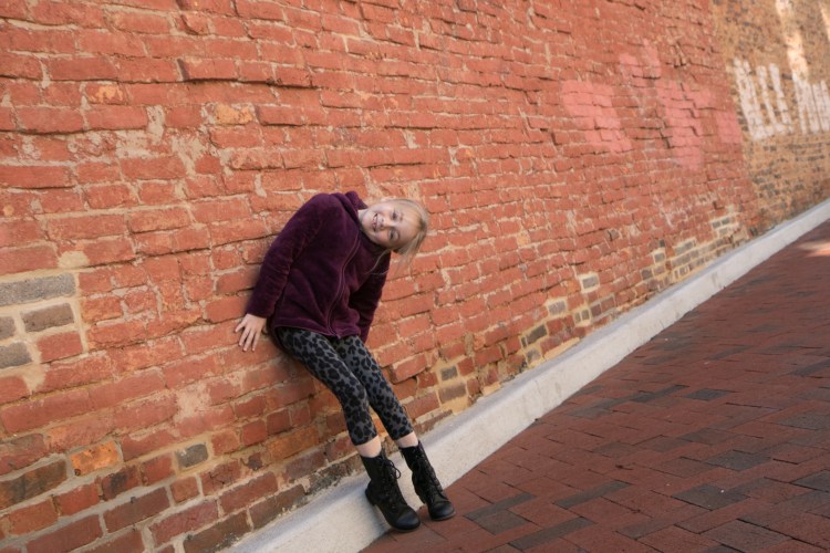
Plus, how cool is this wall. It was just begging to be posed in front of. I believe it’s in Winchester, VA.
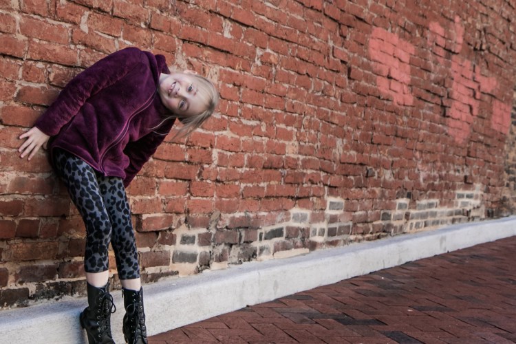
Crazy Portrait – ProjectEdit365 – 22 Oct
I intended to shoot this picture at an interesting angle, but then when I looked at it in the computer, it was just too much. So, I cropped to make the bricks straight, but that ended up cutting off her toes. WAAHHH! I increased the clarity and contrast and lightened the shadows. Also, the picture was super orange so I cooled it down a bit. I also decreased the saturation of the orange color with the orange slider.I used several adjustment brushes: to sharpen her eyes, to lighten the coat and leggings; to decrease the contrast of her face and clothes (since they were too contrasty from increasing the contrast of the whole photo) and on the whitish bricks to tone down the yellowness. I then used a radial filter to darken her surroundings but keep her lighter. Here’s the original:
We have ducks living at our lake in our neighborhood. And, of course, we have become one of many welfare providers for them. My girls even looked up the proper food for ducks. They are Muscovy ducks. They’re not pretty at all, but very tame (they know what they have to do to maintain a constant source of food). . .
Feeding the Muscovies – ProjectEdit365 – 21 Oct
The original is dark. The sun has not been cooperating with me lately – either too bright or nonexistent. I lightened up the picture and then turned it black and white. I increased the clarity and contrast and adjusted the highlights, shadows, whites, and blacks to get a look I was satisfied with. Not too much done to the original, but the difference is pretty big to me. Here it is:
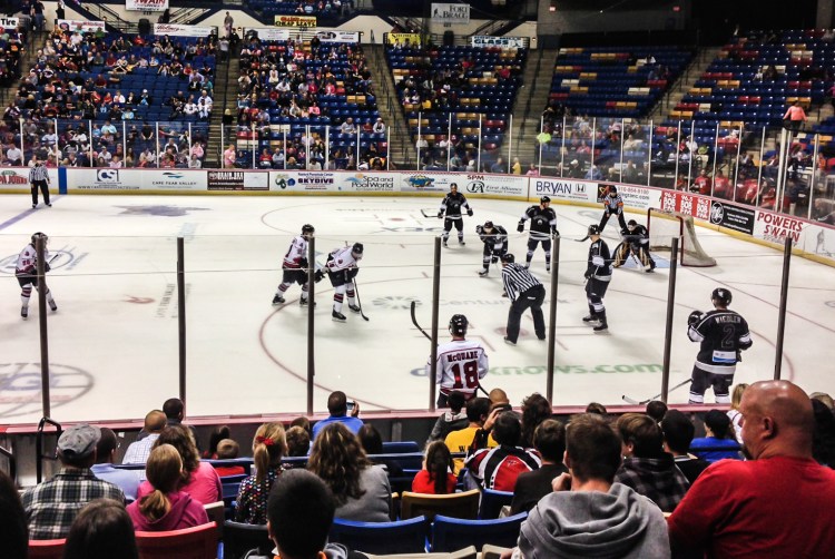
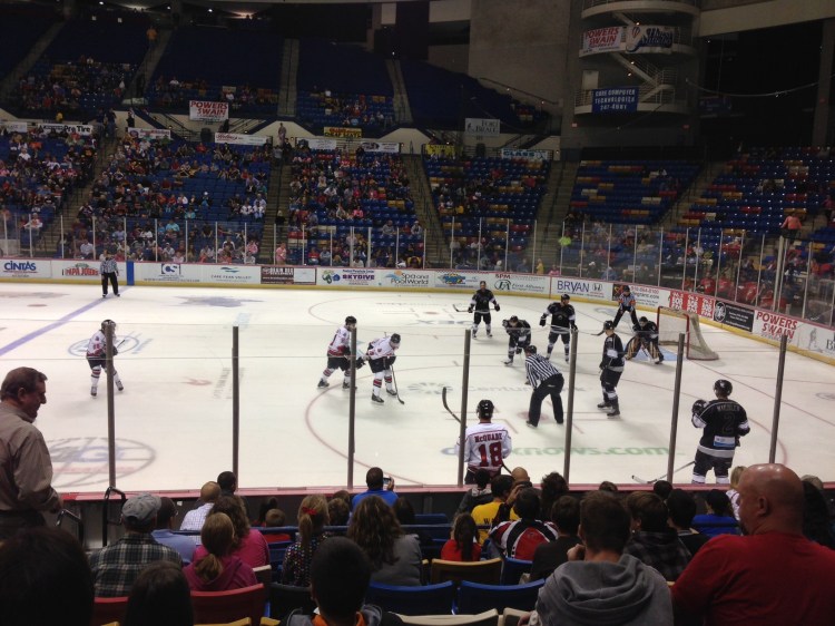
We love watching sports live! There’s something about being in the mix with the players, the fans, the action, the food, the thrill. Even minor league games (which are so much cheaper!). Here we’re rooting for the Fayetteville Fire Antz.
Hockey action – ProjectEdit365 – 20 Oct
The original was flat and a little dark. I cropped in to put the focus more on the ice, cutting out a random fan and some upper seating. I increased the contrast and clarity to give it more of an edgy look. I lightened the shadows and blacks since increasing the contrast can darken those. I then reduced the noise. Here’s the original:
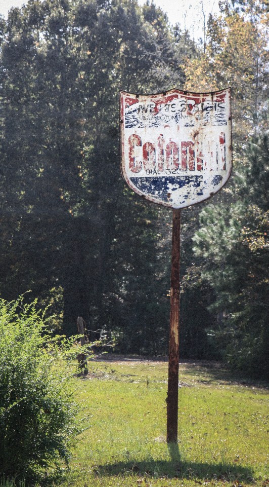
Somewhere near Fayetteville, NC stands this old sign. The longer you look at it, the more words and numbers you end up noticing!
Old Colonial Sign – ProjectEdit365 – 19 Oct
The original was crooked and flat (too bright outside!) and had telephone wires protruding from the back of it. I cropped to straighten and then cloned out all wires (not perfectly though). I decreased the saturation and the highlights of the whole picture and added a small vignette. I created an adjustment brush to enhance the sign itself. In the end I think I added a preset on top of everything and then added grain. It took so much to figure out how to get the picture to look the way I wanted it to (without immediately going to the presets). Here’s the original:
I went shooting with a couple photographers from the Miami area and my girls stood in as the models. I shot with a 50mm lens – I’m used to having my 17-55 and zooming whenever I need so this was a challenge to frame properly. In most of the pictures a body part is chopped off. I’d really like to try a 28mm. I listened to a podcast recently and the photographer only shoots with a 28, and I like the way her pictures look. I *know* that the equipment does not a good picture make. . . but it would be fun to rent one.
Bohemian Dreamer – ProjectEdit365 – 18 Oct
The original was too cool. I lowered the highlights and clarity. I warmed the temp and moved the tint towards magenta. A little bit of sharpening and noise reduction and a small vignette. I used an adjustment brush on her face to lighten the highlights and brighten it a bit. I used another brush on the wood in increase the clarity and sharpness. I cropped out the sign that’s behind her hat. Here’s the original: