Spaghetti Garden

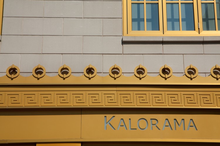
Cool font and neon. Now I want spaghetti.

The neon sign of the Spaghetti Garden in Adams Morgan in Washington DC Not So SAHM
Spaghetti Garden – ProjectEdit365 – 20 June

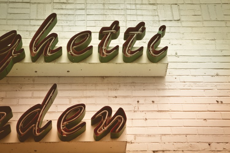
This is way out of my regular editing style. The original was just so plain and too clean for urban neon. I wanted to edit it to look more vintage. I messed with everything: highlights, vibrance, exposure, contrast, clarity, saturation, temperature, etc. In the end I added a couple of LightRoom presets on top of the edits I made. Summer Haze and then Punch. What do you think? I’m not sure what to think.

20June

~~~   ~~~   ~~~   ~~~   ~~~   ~~~   ~~~   ~~~   ~~~   ~~~   ~~~   ~~~   ~~~   ~~~   ~~~

Yellow

This is the yellow on the building with the balconies that I posted about yesterday.

I love the lines! I want to live in the building just because the outside is so neat.

The yellow features of a Kalorama building stand out in the sun Not So SAHM
Yellow – ProjectEdit365 – 19 June

You can see the building bowing that the lens creates in the original picture below. The dark line on the bottom looks like it’s bowing up a bit in the middle. I clicked “Enable Profile Corrections” in the Lens Corrections portion in LightRoom. That flattened it out. I cropped in a little to eliminate the yellow line on the left. I sharpened the whole picture and then worked on whitening the bricks and brightening the yellow.

19June

~~~   ~~~   ~~~   ~~~   ~~~   ~~~   ~~~   ~~~   ~~~   ~~~   ~~~   ~~~   ~~~   ~~~   ~~~

Balconies

They’re so cute!

I love this building. Doing some quick Google research, I believe this is an apartment building. It’s located in the Kalorama neighborhood of Washington D.C.

Balconies show off on a Kalorama building in Washington DC Not So SAHM
Balconies – ProjectEdit365 – 18 June

The original, below, was cute enough, but I cropped in to eliminate most of the building on the right. I love the yellow and will feature that in an edit soon, but I wanted to showcase the balconies and the lines so I made it black and white. In Lightroom, when you choose B&W you get to adjust each color individually, which affects the look of the black and white. A lot of time I just decrease the saturation to 0%, but this is probably the better way to make a picture black and white. I increased the clarity just a little bit and then increased the shadows to keep it from getting too dark. It still felt a little dark to me so I increased the highlights a bit.

18June

~~~   ~~~   ~~~   ~~~   ~~~   ~~~   ~~~   ~~~   ~~~   ~~~   ~~~   ~~~   ~~~   ~~~   ~~~

Urban Wildlife

I would love to know the life story behind the person who designed this little set up. I found this in the Adams Morgan neighborhood of D.C.

There’s so much going here (including a No Hunting or Fishing sign…).

Someone has set up several old toys outside their home window Not So SAHM
Urban Wildlife – ProjectEdit365 – 17 June

The original was underexposed and too sharp. I increased the exposure and decreased the contrast to bring out a little detail. I increased the clarity, saturation, and vibrancy quite a bit. I did some individual color adjustments with yellow and orange. Then I added some grain and a little vignette. I straightened the picture using the lines of the brick in the middle, but I’m not sure which I like better.

17June

~~~   ~~~   ~~~   ~~~   ~~~   ~~~   ~~~   ~~~   ~~~   ~~~   ~~~   ~~~   ~~~   ~~~   ~~~

Layers

Now a pharmacy, it used to be a . . .  (I can’t quite read the letters underneath)

Layers of paint advertise various businesses in Adams Morgan Not So SAHM
Layers – ProjectEdit365 – 16 June

The original lacked contrast so I increased that and the clarity. I also increased the highlights and lightened the shadows. I adjusted the blue color a little and added a little vignette. I think doing all this helped bring out the texture.

16June

~~~   ~~~   ~~~   ~~~   ~~~   ~~~   ~~~   ~~~   ~~~   ~~~   ~~~   ~~~   ~~~   ~~~   ~~~

Spoke

love urban photography. I don’t get out and shoot in urban settings as much as I’d like. Several years ago a friend and I went on a group “photo safari” to Adams Morgan in DC. I was so excited tonight when I looked through the next batch of June pics to find some to edit. Street shots!

The spokes of a bicycle in black and white Not So SAHM
Spoke – ProjectEdit365 – 15 June

I was definitely looking for lines and angles this day. I like the depth of field in the original (below), but in color it just doesn’t do anything. This edit was quick. I increased the clarity and contrast and then increased the shadows and blacks a bit to undo how dark things get when you increase contrast. I didn’t touch the grain because I like how grainy it looks.

15June

~~~   ~~~   ~~~   ~~~   ~~~   ~~~   ~~~   ~~~   ~~~   ~~~   ~~~   ~~~   ~~~   ~~~   ~~~