Na Pali Coast

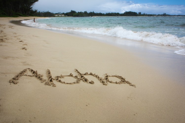
So rugged and forbidding, which makes it intriguing. God had fun forming this coastline.

I couldn’t help but imagine young, native Hawaiians trying to explore the nooks and crannies.

The rugged coastline of Na Pali in Kauai Hawaii Not So SAHM
Na Pali Coast – ProjectEdit365 – 14 July

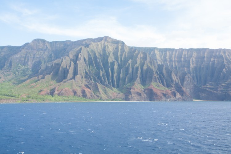
It was so bright and hazy that day. The original shows that well:

14July

I started by lowering the contrast and increasing the clarity. I decreased the highlights and made the shadows and blacks a little darker. I used three different adjustment brushes to work on the three different areas of rock: left, front and center, and right. With each I increased the contrast, lowered the clarity, and sharpened them. Now I’m wondering why I just didn’t do that to the whole picture instead of lowering the contrast at first. I increased the vibrancy of the whole picture and then did some slight color adjustments to each color. The blue was too vivid, so I decreased the saturation in it just a tad. I worked with the greens and aquas until I got them where I wanted. In the end, I think it’s easier to see the detail of the formations.

~~~   ~~~   ~~~   ~~~   ~~~   ~~~   ~~~   ~~~   ~~~   ~~~   ~~~   ~~~   ~~~   ~~~   ~~~

Aloha!

a salutation

a farewell wish

but really – love, affection, peace

America needs some aloha right now.

The word aloha is written the in the sand of a beach on the Hawaiian island of Oahu Not So SAHM
Aloha! – ProjectEdit365 – 13 July

I was so excited to try some beach writing out when we went to Hawaii. The original shot didn’t quite cut it though. The horizon wasn’t straight so I straightened that. I cloned and healed out the footprints and the little head bobbing in the water in the distance. I increased the contrast and decreased the clarity. I upped the highlights and vibrance. Lastly I added a small vignette. The only thing that could make it better would be a palm tree! Aloha, my friends!

13July

~~~   ~~~   ~~~   ~~~   ~~~   ~~~   ~~~   ~~~   ~~~   ~~~   ~~~   ~~~   ~~~   ~~~   ~~~

Strike!

The Nats’ baseball stadium is one of the best out there. Says she who has visited maybe five stadiums. I’m a little biased. It’s got great views, amazing food choices, and the giant-headed presidents. What’s your favorite stadium?

Silver baseballs line the outside of the Nationals' baseball stadium in Washington D.C. Not So SAHM
Strike! – ProjectEdit365 – 12 July

At first I cloned out the smoke stacks and then realized I didn’t like all that space. So I cropped in to focus on the movement of the baseballs. I decreased the contrast and increased the clarity. Lightened up the shadows. At this point the sky was dull so I increased the vibrancy, but it brought out too much yellow in the building. So, I went to the blue slider and increased the saturation. There was a bit of noise so I decreased that and then added a small vignette. Here’s the original:

12July

~~~   ~~~   ~~~   ~~~   ~~~   ~~~   ~~~   ~~~   ~~~   ~~~   ~~~   ~~~   ~~~   ~~~   ~~~

Herbs and potions

There might not be potions in the jars, but I bet if you mixed a couple you’d have something pretty powerful. These jars line the apothecary in Alexandria, VA I showed you the other day.

The Stabler-Leadbeater Apothecary Shop:

Jars of herbs and medicine line the shelves of an apothecary in Alexandria, VA Not So SAHM
Jars of Potions – ProjectEdit365 – 11 July

I straightened up the original. I warmed the picture, decreased the contrast and increased the clarity and vibrance. I sharpened it and reduced the noise, and created a slight vignette. The main edit for this was straightening it and and warming it up a bit.

11July

~~~   ~~~   ~~~   ~~~   ~~~   ~~~   ~~~   ~~~   ~~~   ~~~   ~~~   ~~~   ~~~   ~~~   ~~~

Beach Jumping

She claims to not like the beach.

But she was having all kinds of fun here.

A girl jumps in anticipation as the ocean water creeps towards her feet Not So SAHM
Beach jumping – ProjectEdit365 – 10 July

I took this picture either with my iPhone or my Nikon Coolpix waterproof camera. Either way, it was terribly grainy. To reduce that I reduced both the clarity and contrast and moved the noise slider all the way to 100. Moving it that far eliminates a lot of detail, but I decided to use that to my advantage here. I also sharpened the whole picture, but since the noise slider was so far to the right it didn’t introduce new grain. I increased the vibrance of the whole picture and increased the aqua saturation just a little. I added a small vignette and then ran a Lightroom preset (Coffeeshop Neptune) to give it a slight washed out look. Here’s the original:

10July

~~~   ~~~   ~~~   ~~~   ~~~   ~~~   ~~~   ~~~   ~~~   ~~~   ~~~   ~~~   ~~~   ~~~   ~~~

Beach morning

The Gulf Coast – some of the best beaches in the world.

Pairs of wooden beach chairs line a Pensacola Beach Not So SAHM
Beach Sunrise – ProjectEdit365 – 09 July

I got a beach picture with no one in it because I was out pretty early in the morning. You can tell that because my ISO is so high it made the picture grainy. But, this editing challenge isn’t about using the perfect picture to begin with. It’s about taking what I’ve got and trying to make something of it. I do like the linen effect the final picture has.

To the original, I cropped in to tighten on the beach chairs. I moved the tint slightly towards the magenta side. I increased the exposure and clarity just a tad. I went into the individual color selector and adjusted the red, blue, and purple, slightly to get the look I wanted. I brought the noise down, almost taking the slider over to 100. Yikes! And I did a lens correction to help the horizon seem a little less bulging in the middle. I used a radial filter (I think for the first time), to create just a slightly brighter area in the bottom center.

I hope all that makes sense! Here’s the original:

09July

~~~   ~~~   ~~~   ~~~   ~~~   ~~~   ~~~   ~~~   ~~~   ~~~   ~~~   ~~~   ~~~   ~~~   ~~~